
Concept
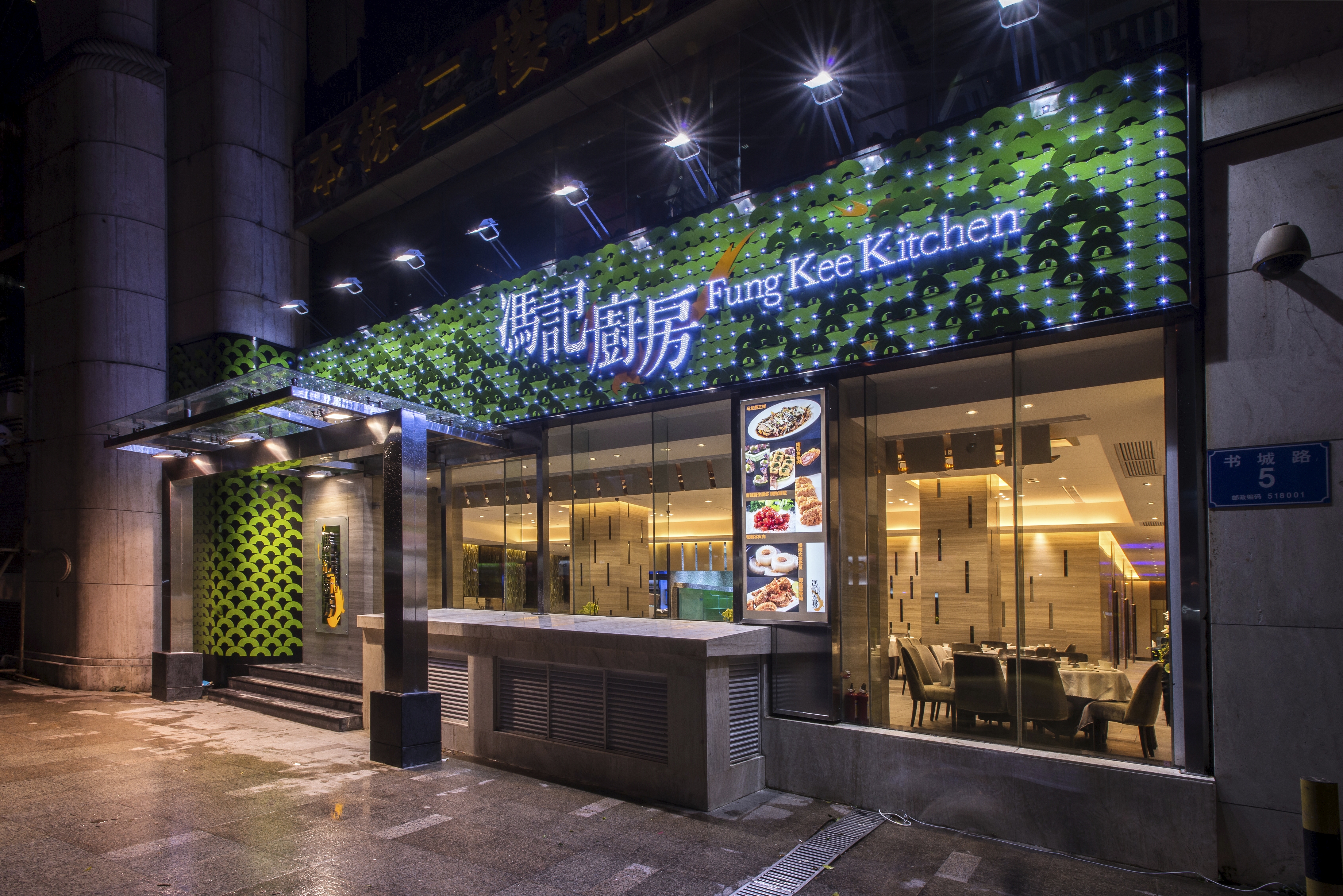
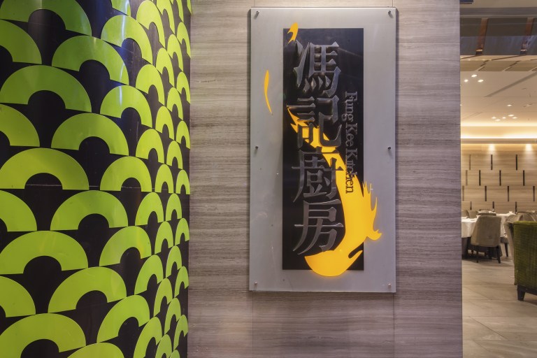
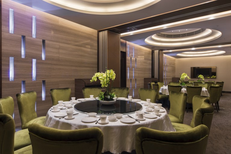
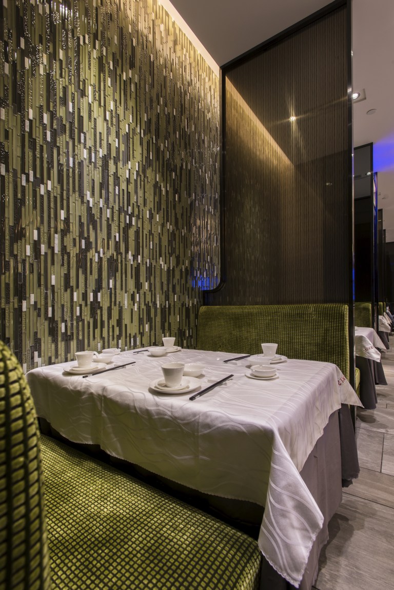
Fung Kee Kitchen is well known Cantonese cuisine kitchen (精品粵菜) in the area of Lo Wo (羅湖). Clients requested a polished and modern dining place for their up middle class customers. They expected to see marble, special glass and mosaic all high quality materials in the restaurant. My inspiration was Koi fish (鯉魚). Koi fish symbolizes success and wealth in China. I was interested in those fish scale pattern and the layering which can be applied in interiors.
Façade
The old version of Fung Kee Kitchen logo was in cartoon font and the façade was in red and gold colours. I recommended a very experienced graphic designer, tamshui.com, and revamp the whole look of Fung Kee. (Graphics design of Fung Kee Kitchen will be post next) The building itself was in white travertine but there was a big red signage of an internet bar above our signage. Then I decided to use green as the accent colour for the restaurant. Green gives peaceful and calm feelings to people and green represents water and nature that would be coherent to my inspiration Koi fish scale. Using hundreds of semi-circle metal green plates to compose the new façade, some of the green plates were folded outwards and made the façade become more three dimensional.

Lightings
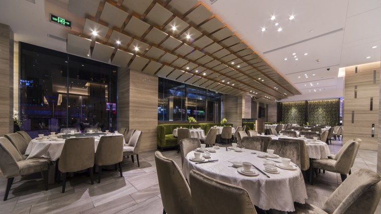
Yes, as you can see, there is no pendant light in the restaurant. Instead of using decorative lights, I design something more architectural. The ceiling near the entrance was composed by 165 nos. of metal plates with LED lights behind. They stacked up and create a soft curve ceiling. The orange colour LED light contrast with the green surrounding and turn the whole place warmer. It just likes sunshine. That is a beautiful accident. The contractor cannot give us off white colour LED lights, then I have to choose from yellow or orange colour.

This is a definitely challenging project in terms of the time schedule. Concept design and documentation for a Chinese restaurant about 600 square meters were completed in one and a half month and overlapped with the onsite construction. All materials were selected in mainland china, Shenzhen. Right after I submitted the drawing documentation, it was Chinese New Year. Factories and suppliers were closed for holiday and luckily we managed to place order for the key materials before that.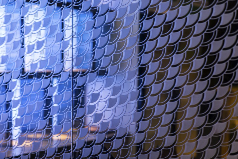
Client: Man Hing F&B Management Ltd.
Interior design: Chiling Leung@:MILL:WORK
Logo design: Tamshui@tamshui.com
Photographer: Jason Hung
